![ID-logo-colour_version_2.png]](https://answers.id.com.au/hs-fs/file-2628100188-png/images/ID-logo-colour_version_2.png?height=40&name=ID-logo-colour_version_2.png)
Education indicators brings school supply and school-age population together for a catchment you've drawn. Use it when you need to know whether the schools in an area can absorb the children the forecast says are coming.
Before you begin
You need a catchment. If you haven't drawn one yet, start with How to create a catchment in Placemaker.
Enrolments, school characteristics and school locations come from the Australian Curriculum, Assessment and Reporting Authority (ACARA), 2025. Capacity to contribute (CTC) scores come from the Department of Education, 2025, and apply to non-government schools only. Charts cover the 10 most recent ACARA years and roll forward as new years are released.
Steps
- Open Insights: Select 'Insights' in the top navigation bar.
- Choose your catchment: Use the catchment selector at the left of the filter bar. Everything on the page is scoped to whichever catchment is active.
- Open the Education indicators tab: Select 'Education indicators', the third tab under the main navigation.
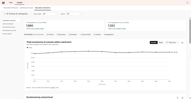
- Move between sections: Use the list on the left – population overview, total enrolments, enrolments by level, enrolments over time and school details – to jump to the section you want.
- Narrow to a type or sector: Use the 'School type' and 'Sector' dropdowns in the filter bar. These narrow the enrolments over time chart and the school details table only. The population overview, the catchment summary counts and the two enrolment charts above them stay at the full catchment, so you always keep the whole picture in view while you drill into part of it.
- Take the data with you: Each chart and the school details table has a download control in its top right, for png and csv.
What to expect
The tab gives you five outputs, each answering a different planning question.
- Population overview – primary aged (5 to 11) and secondary aged (12 to 17) population at the end of your selected forecast range, with the change from the start year. This is your demand side: it tells you how many children the catchment will need to seat, and whether that number is rising or falling.
- Catchment summary counts – the number of schools in the catchment, broken down by type and by sector. This is your supply side at a glance, and it tells you whether provision is concentrated in one sector.
- Total enrolments – how many students are enrolled across all schools in the catchment, each year for the last 10 years. Switch between 'Number' and 'Share', and break the total down by sector or by school type. Use it to see whether the catchment as a whole is growing or contracting, and whether one sector is taking a larger share over time.
- Enrolments by school level – catchment enrolments split into primary aged and secondary aged. Combined schools are apportioned across both bands using their actual year-level enrolments. Use it to see which end of the system is under pressure.
- Enrolments over time and school details – enrolment history for each school and a row per school with suburb, sector, type, co-ed status, year levels, five-year enrolment change, Index of Community Socio-Educational Advantage (ICSEA) value and percentile, language background other than English and capacity to contribute (CTC). The chart shows the eight largest schools by default; narrow it with the School type and Sector filters. Together these tell you which individual schools are filling and which are emptying, which is the argument you take to a school authority.
-png.png?width=670&height=235&name=10_12_Easey_St__Collingwood_Enrolments_over_time_20260813%20(1)-png.png)
Two things shape what you'll see in the table.
ACARA reports enrolments per school rather than per campus. A campus row therefore carries the characteristics of its head campus – co-ed status, ICSEA, year range and CTC – but has no enrolment history of its own. Its five-year change reads as absent, and it isn't counted in any chart or total. This is why the school details table can list more schools than the charts.
Where ACARA holds no value for a school, the field shows a dash rather than a zero. CTC shows a dash for every government school, because it applies to non-government schools only.
Troubleshooting
If the tab reports no schools in your catchment, the catchment boundary contains no school coordinates. Widen it, or redraw it around the area you're planning for.
If school data fails to load, use the retry to load it again. The population overview stays available even when school data doesn't load, so you can still read the demand side.