![ID-logo-colour_version_2.png]](https://answers.id.com.au/hs-fs/file-2628100188-png/images/ID-logo-colour_version_2.png?height=40&name=ID-logo-colour_version_2.png)
This guide shows you how to see how affordable buying and renting a home is for different household types and income levels in your local government area and how that has changed over time.
Before You Begin
Open your council’s Housing Monitor site in your browser. For example, the City of Greater Geelong site is at housing.id.com.au/geelong. If you’re not sure of your council’s site address, see How to find a council’s Housing Monitor site.
Note: the affordability threshold is the price or weekly rent a household on the selected income could pay without moving into housing stress, based on 30% of gross income - and for buying, on assumptions about interest rates, deposit and loan terms. It is calculated from inflation-adjusted 2021 Census incomes rather than from current incomes. ‘Affordable sales’ and ‘affordable rental listings’ count sales and advertised listings priced at or under that threshold; they are not a count of homes those households secured, and not a share of all housing in the area.
Steps
- Open the Affordability Monitor: click ‘Affordability Monitor’ in the left-hand menu. The section expands to show six topics covering how affordable and how available housing is to buy and to rent.
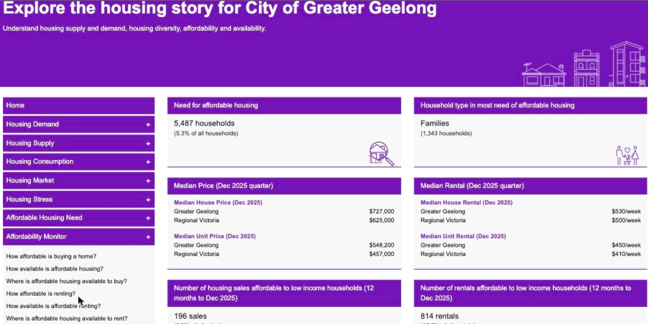
- Choose a topic: click ‘How affordable is buying a home?’. The ‘Affordability and availability’ page opens with a control bar at the top.
- Select a household type: choose from the ‘Household type’ dropdown in the control bar. The options are ‘Average all households’, ‘Lone person’, ‘Couple without children’, ‘Couple with children’, ‘One parent family’ and ‘Group household’.
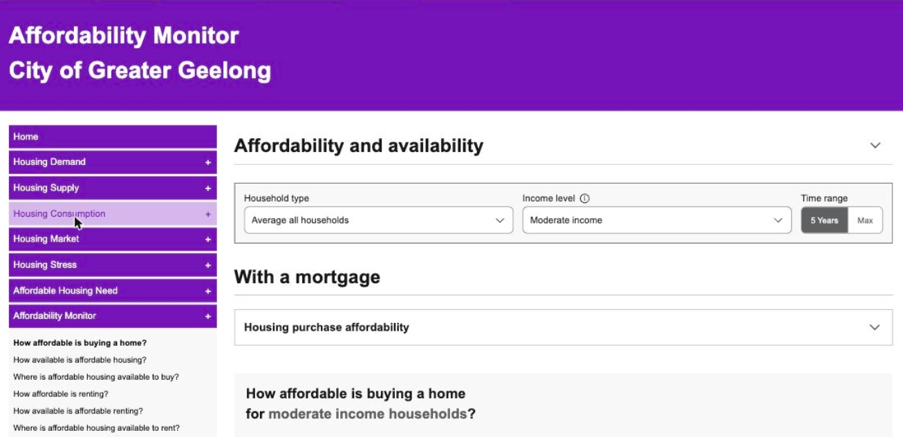
- Select an income level: choose ‘Very low income’, ‘Low income’ or ‘Moderate income’ from the ‘Income level’ dropdown. ‘Very low’ means below 50% of the regional median income for that household type, ‘low’ is 50 to 80% and ‘moderate’ is 80 to 120%. Your household type and income level selections apply to the whole page: the purchase, rental, sales, listings and map sections all update together and each section heading names the selection you’ve made.
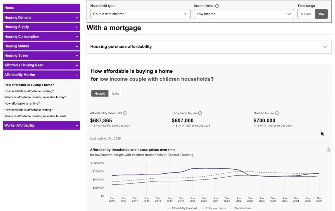
- Review purchase affordability: under the ‘With a mortgage’ heading, the page shows three measures: ‘Affordability threshold’, ‘Entry level house’ and ‘Median house’, each shown with how much it has changed. A ‘Houses’ / ‘Units’ toggle switches between dwelling types, and the charts below compare the affordability threshold with entry level and median prices over time.
- See how much housing was affordable to buy: review the next section, which shows ‘Total sales’, ‘Affordable sales’ and ‘Affordable sales (%)’ - the number of sales in the period priced at or under the affordability threshold. Tabs narrow the results to ‘1 bedroom’, ‘2 bedrooms’ or ‘3+ bedrooms’ dwellings and a ‘Percentage’ / ‘Number’ toggle changes how the chart displays.
- See where housing was affordable to buy: review the map section, which shows affordability across small areas within the LGA. A time period dropdown selects the 12-month period, a ‘Map’ / ‘Satellite’ control changes the view and the small-area table compares each area’s sales, affordable sales and median prices (‘Show all’ lists every area). This is the part of Housing Monitor that answers which suburbs were still within reach.
- Review rental affordability: scroll down to the ‘Renting’ heading. It mirrors the purchase layout with weekly ‘Affordability threshold’, ‘Entry level house’ and ‘Median house’ measures, rental affordability charts and a section showing ‘Total rental listings’, ‘Affordable rental listings’ and ‘Affordable rental listings (%)’ - counts of advertised listings priced at or under the threshold. A map shows where renting was affordable across the LGA.
- Extend the time range: click ‘Max’ on the ‘Time range’ toggle in the control bar to extend the charts from the default five-year view to the full history available for your area.
What to Expect
The section headings name the household type and income level you selected, so you can confirm you’re looking at the right group. The ‘Affordability thresholds and house prices over time’ chart shows how the affordability threshold has tracked against entry level and median prices for your selections.
Every chart and both maps have an ‘Export menu’ control. The date of the most recent data update appears alongside the headline measures.
You’ll be able to say three things with evidence: what a given household type on a given income could afford, how far that sits above or below entry level and median prices, and which parts of the area still had affordable sales or listings. Read the threshold line together with the price lines before concluding the market has shifted. Because the threshold is calculated from income rather than from prices, a large year-on-year movement in the threshold, and in the affordable counts that depend on it, can reflect the income adjustment rather than a change in what was sold or advertised. The two ‘Difference between...’ charts are the quickest way to see which is which.
Troubleshooting
If the figures don’t match what you expected, check the ‘Household type’ and ‘Income level’ selections in the control bar first. The affordability threshold recalculates for the group you select; entry level and median prices don’t change with these selections.
If a chart only shows recent years, the ‘Time range’ toggle is set to ‘5 Years’. Click ‘Max’ to see the full history.