![ID-logo-colour_version_2.png]](https://answers.id.com.au/hs-fs/file-2628100188-png/images/ID-logo-colour_version_2.png?height=40&name=ID-logo-colour_version_2.png)
When you pick a data theme in Placemaker, the map divides the values into coloured bands and shades each area according to the band it falls into. Placemaker sets those bands for you, choosing a method that suits the type of data you're looking at. This keeps the map readable and consistent: growth and decline read correctly, and a colour means the same value whichever forecast year you're viewing. You choose the colour scheme and how opaque the shading is.
Key concepts
Classification, classes and breaks
A classification groups the values in a data theme into a set number of bands, called classes. The points where one band ends and the next begins are the breaks. The legend lists every band with its value range and its colour, ordered from lowest to highest.
What you can and can't change
Placemaker sets the method, the breaks and the number of classes. You can't change those. What you can change sits in the legend: pick a colour scheme from Brown–Teal, Red–Green, Orange–Purple or Red–Blue, and set the layer opacity, which starts at 80%.
Setting the breaks centrally means a colour carries the same value across every area you can see, and small movements in the data don't read as real growth or decline.
For a single-year theme, the breaks also hold steady as you move through the forecast years, so you can compare one year against another.
For a year range, expect the breaks to change when you change the range. They're calculated from the data in the range you picked, so 2026 to 2036 and 2036 to 2046 won't share the same bands.
The three methods
Placemaker picks the method from the type of measure in the theme. A sequential palette runs light to dark in a single hue, for values that only rise. A diverging palette uses two contrasting hues either side of a neutral middle, for values that can fall as well as rise.
| Measure | Method | Palette | Themes it applies to |
|---|---|---|---|
| Count for a single year | Fixed rounded breaks | Sequential | Total population, total dwellings, population by age |
| Percentage | Equal interval based on min and max values. | Sequential | Percentage of total population |
| Change between two years | Fixed rounded breaks with a neutral band | Diverging | Change in population, change in population by age, change in dwellings, net dwellings per site |
Fixed rounded breaks
Counts use breaks rounded to readable values, drawn from the 1, 2.5 and 5 series scaled by powers of 10. Bands land on 500, 1,000 or 5,000 rather than on 512, 1,037 or 4,850.
Equal interval
Percentages divide the full range into equal steps. Placemaker takes the range, divides it by seven, then rounds the step to a readable value such as 0.25, 0.5, 1, 2.5, 5 or 10. The bands cover the range the data actually spans, not the full 0 to 100%. An age group running from 4% to 31% across the forecast period gets bands stepping up to 35%, not bands from 0 to 100.
The neutral band on change themes
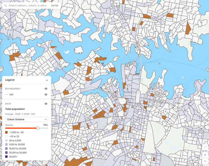
Change themes use a diverging scheme: one colour for the low end, a distinct colour through the middle and another for the high end. Which colours you see depends on the scheme you pick.
Values from −25 to 25 sit in a single neutral band. The same threshold of 25 applies to every change theme, whether it counts people or dwellings. A change smaller than that won't shift a major infrastructure decision, so the map shows it as stable rather than as growth or decline. The threshold is a count, so it doesn't scale with the size of the area. The band shows as its value range in the legend, so look for −25 to 25 rather than a word like 'neutral'.
Placemaker splits the remaining six bands between the negative and positive sides in proportion to the range of the data on each side. That split is often lopsided. Where growth far outweighs decline, you can end up with one band below the middle and five above it.
Number of classes
Seven classes by default. Where the range of the data can't produce seven distinct breaks, Placemaker reduces the count, to a minimum of four.
How the breaks are calculated
What the breaks are calculated over
Placemaker calculates the breaks over two things: an area and a time period.
The area is everything your workspace covers, known as your entitled extent. If your workspace covers Victoria, Placemaker calculates the breaks across Victoria rather than across whatever happens to be on screen.
The time period is the whole forecast period, 2021 to 2046. For a single-year theme, Placemaker takes the minimum and maximum values across that full period and holds the breaks steady as you change the displayed year. That's why the map doesn't recolour when you step from 2026 to 2046, and why you can compare the two.
When the breaks recalculate
Placemaker recalculates the breaks when you change the measure, for example from a count to a percentage. It also recalculates when you change the sub-theme, for example from total population to an age range, when you change the boundary, for example from SA1 to SA2, and when you change a year range. For what those boundary levels are, see What are standard ABS geographies?.
It doesn't recalculate when a single year is selected and you change the displayed year.
Areas with no value shown
Placemaker doesn't show a percentage for an area with a base population under 50 persons, because a percentage of a very small count is unreliable. Placemaker leaves those areas out of the break calculation and shades them in a distinct 'data not shown' state, separate from the neutral band. Placemaker gives the base population count so you can see why the value is withheld.
How this applies in Placemaker
The legend panel is where you read the classification. It shows the theme and sub-theme as a title, then a sub-line giving the measure, category, time period and boundary, separated by a middot (·). For example 'Total population' with a sub-line of 'Count · 2029 · SA1', or 'Population by age' with 'Change · Ages 0–10 · 2029 → 2046 · SA1'.
Under the sub-line sit the colour scheme picker and the opacity slider, then the bands, each with its colour and value range, ordered lowest to highest.
The legend holds two separate controls. 'Hide catchments' under BOUNDARIES turns your catchment outlines off, which lets you click through to the data underneath. 'Hide data layer' under DATA turns off the shading and collapses the bands. One data layer is active at a time.
Frequently Asked Questions
Q: Can I set my own colour ranges?
A: You can change the colour scheme and the opacity from the legend, and there are four schemes to pick from. You can't change the breaks themselves. Placemaker sets those so a colour carries the same value for everyone in your workspace, across every area you can see and across every forecast year. Setting your own breaks would remove that consistency, and two people looking at the same map could read it differently.
Q: Why didn't the colours change when I moved to a later forecast year?
A: For a single-year theme Placemaker calculates the breaks once, from the minimum and maximum values across the whole forecast period, 2021 to 2046. They stay fixed as you change the year, so you can see growth by watching areas shift into darker bands.
Q: Why did the map recolour when I switched from SA1 to SA2?
A: Larger areas hold larger counts, so the range of the data changes and Placemaker recalculates the breaks to suit. The same happens when you change the measure, the sub-theme or a year range.
Q: Why are some areas shown as data not shown rather than shaded?
A: Their base population is under 50 persons, so a percentage would be unreliable. Placemaker excludes those areas from the break calculation and shades them separately from the neutral band. Placemaker shows the base population count for the area so you can see how small it is.
Q: Can I trust the colours if I see colour differently?
A: There are four colour schemes to choose from, so you can switch to one that works for you. Every band is also listed in the legend with its value range, so you can read the map from the numbers rather than the colours.
Q: Why does an area that gained 20 people look the same as one with no change?
A: Both fall in the neutral band, which covers −25 to 25. A movement that small isn't a reliable signal of growth or decline at small-area level, so it's shown as stable. Use a count theme rather than a change theme if you need the underlying numbers.