![ID-logo-colour_version_2.png]](https://answers.id.com.au/hs-fs/file-2628100188-png/images/ID-logo-colour_version_2.png?height=40&name=ID-logo-colour_version_2.png)
Before You Begin
You’ll need your council’s Housing Monitor site open in a browser. If you’re not sure where to find it, see the related article on finding your council’s site. This guide uses the City of Greater Geelong site as its example, so the screenshots show Geelong data.
Note: the sale and rent figures come from PropTrack (REA Group) sales and rental listings and update twice a year, normally March and September, so date every figure you quote. Rent figures are advertised listing prices - what is being asked for homes coming onto the market - not the rents sitting tenants pay. Sale figures are based on actual sales. These charts cover the whole local government area against its comparison region.
Where to find the data
1. Open the Housing Market section: In the left navigation menu, click ‘Housing Market’. The section expands to show its topic links, including ‘How have housing prices been changing?’, ‘How have unit prices been changing?’, ‘How have house rental prices been changing?’ and ‘How have unit rental prices been changing?’.
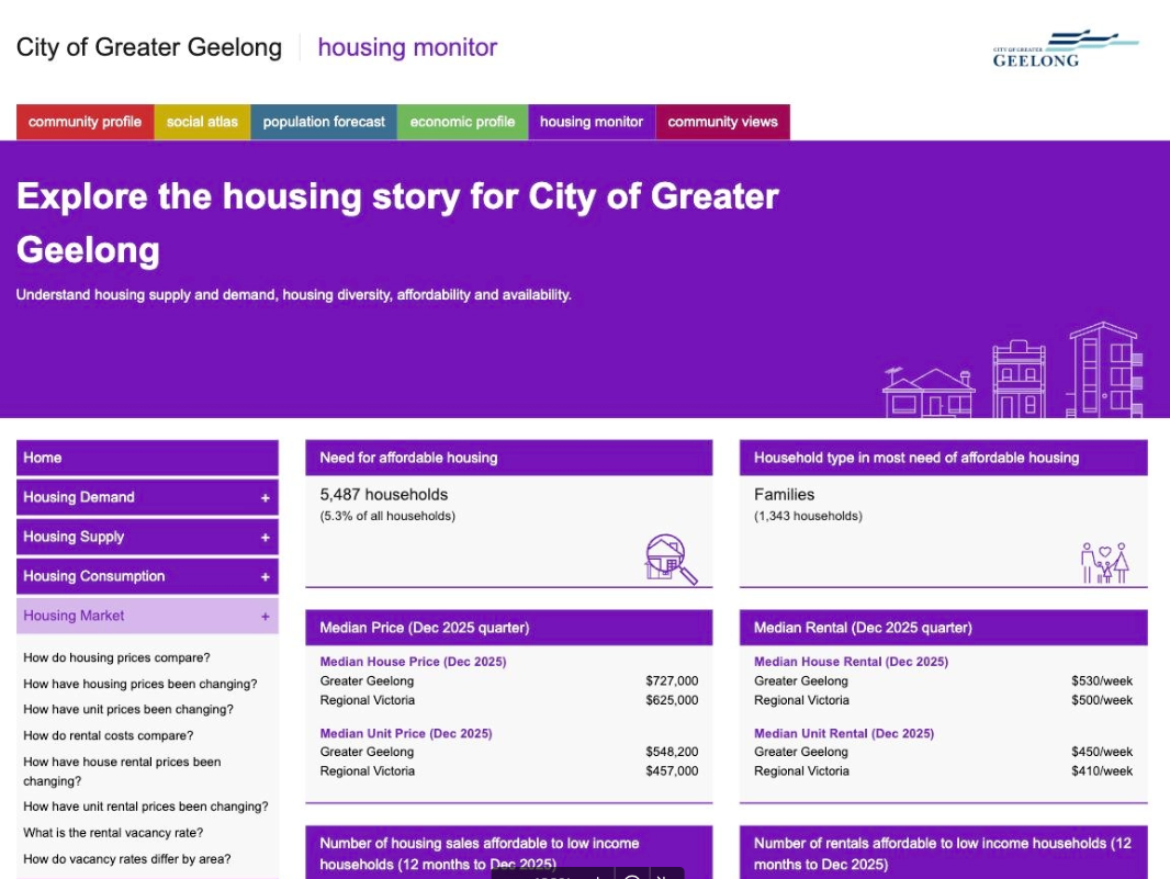
2. Open the house price trend chart: Click ‘How have housing prices been changing?’. The Housing Market page opens at the section headed ‘How have house prices been changing?’
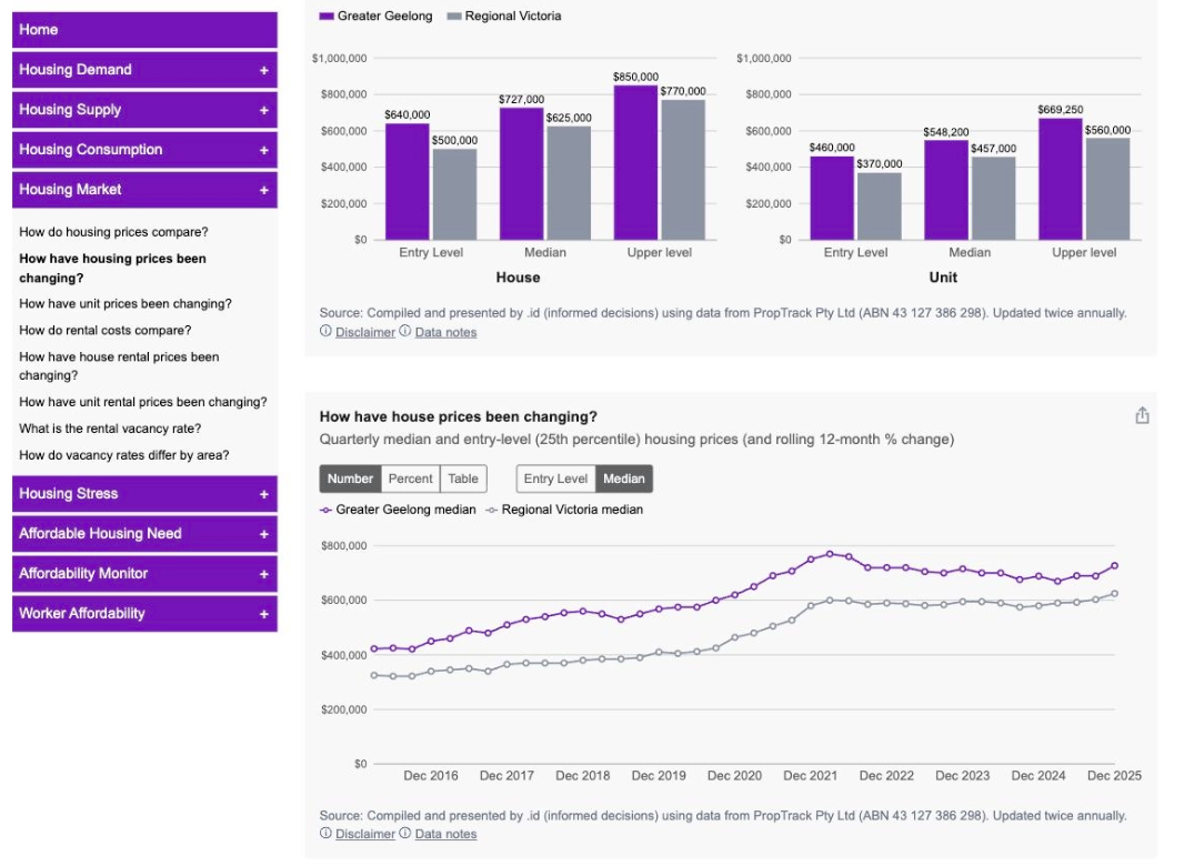
3. Read the trend chart: The chart shows quarterly median and entry-level (25th percentile) house prices for your area alongside its comparison region - the regional or metro area (GCCSA) of your council site. In the Geelong example that comparison is Regional Victoria. Below the chart, a summary sentence states the average annual change in median prices over the past five years for both areas, which gives you a ready-made figure for a briefing.
4. Switch how the data is displayed: Use the ‘Number’ | ‘Percent’ | ‘Table’ toggle on the chart tile. ‘Number’ (the default) shows dollar values, ‘Percent’ shows the rolling 12-month percentage change and ‘Table’ shows the figures by quarter, with the dollar value and 12-month change for each area at both entry level and median. A separate ‘Entry Level’ | ‘Median’ toggle switches the chart between the two price series; it’s unavailable while the Table view is selected.
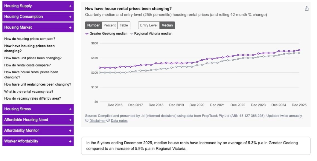
5. View rental price trends: Scroll down to the ‘Renting a home’ section and open ‘How have house rental prices been changing?’. It uses the same toggles as the house price chart and has its own five-year summary sentence. ‘How have unit rental prices been changing?’ sits directly below it, with its own summary sentence.
6. View unit sale price trends: ‘How have unit prices been changing?’ sits directly below the house price chart in the ‘Buying a home’ section, with the same controls and its own five-year summary sentence. Unit and house trends often move at different rates, which matters where a council is arguing for housing diversity.
7. Compare price points for a single quarter: To show the spread of prices rather than the trend over time, open ‘How much does it cost to buy a home?’ in the ‘Buying a home’ section. Bar charts show ‘Entry Level’ (25th percentile), ‘Median’ and ‘Upper level’ (75th percentile) prices for houses and units, with a dropdown to choose the quarter and a ‘Number’ | ‘Change’ toggle. The ‘Renting a home’ section has an equivalent, ‘How much does it cost to rent a home?’, for weekly rental listing prices.
What this tells you
You’ll have three things you can take into a briefing. The trend charts show whether prices and rents in your area are rising faster or slower than the comparison region, which is the evidence behind any claim that local affordability is worsening relative to the wider region. The five-year summary sentences give you one quotable rate of change per measure, so you can state the trend without building your own calculation. The price-point charts show the gap between entry-level and median prices, which indicates how far a first home buyer or a lower-income renter sits from the middle of the market.
In the Geelong example the house rental summary reads: ‘In the 5 years ending December 2025, median house rents have increased by an average of 5.3% p.a in Greater Geelong compared to an increase of 5.9% p.a in Regional Victoria.’
Sale and rental price data is compiled by .id using data from PropTrack and updated twice a year. Every chart tile carries an ‘Export menu’ icon at its top right, for taking the chart or its figures into a report.
Troubleshooting
If a chart appears empty when the page first opens, wait a moment. Charts draw shortly after the page loads, so blank axes fill in on their own.
Related Articles
How to find your council’s Housing Monitor site
How to use Housing Monitor data in reports and presentations
What is Housing Monitor?