![ID-logo-colour_version_2.png]](https://answers.id.com.au/hs-fs/file-2628100188-png/images/ID-logo-colour_version_2.png?height=40&name=ID-logo-colour_version_2.png)
Schools are one of the first things a planner looks for when working out what a growing community already has. This guide shows you how to turn schools on as a map layer, colour and filter them and open a single school to see its enrolment history.
Before you begin
You need to be signed in to Placemaker.
Schools come from the Australian Curriculum, Assessment and Reporting Authority (ACARA). The layer covers every school in Australia, plotted at the location ACARA records for it.
Steps
- Open the Map: Select 'Map' in the top navigation bar.
- Open the Layers panel: Select the layers icon in the left sidebar – it's the second icon down, showing stacked squares.
- Go to the Locations tab: The Layers panel opens on 'Data'. Select 'Locations', the middle tab. This is where point datasets live, separate from the population and dwelling data on the 'Data' tab.
- Turn schools on: Tick the 'Schools' checkbox. Points appear across the map straight away, and the Legend adds a 'Locations' section.
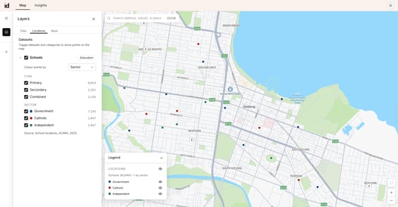
- Choose how points are coloured: Use the 'Colour points by' dropdown to pick 'Sector' or 'Type'. Sector colours points as government, catholic or independent. Type colours them as primary, secondary or combined. The Legend updates to match whichever you pick, and the coloured dots move to that group in the panel.
- Narrow to the schools you need: Untick any category you don't want. Type and sector work together, so the map shows only schools matching both. The counts beside each category update as you go – untick 'Government' and the primary, secondary and combined counts drop to what's left across the catholic and independent sectors.
- Zoom in to see individual schools: Zoomed out, nearby schools group into a numbered circle showing how many are in that group. These circles are deliberately neutral in colour, because a group can hold schools from several categories. Zoom in, or select a circle, until it resolves into individual coloured points.
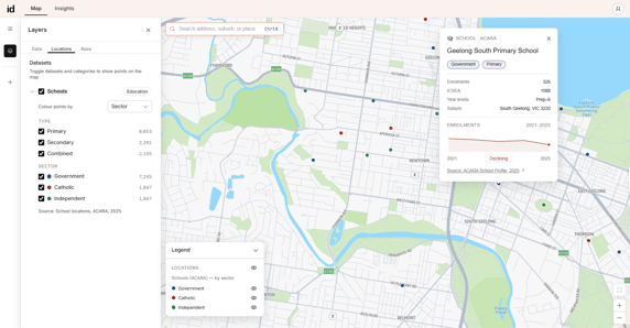
- Open a school: Select any individual school point to open its details. Only one school is open at a time – select another school and the first closes.
What to expect
With the layer on, you can read the schools picture three ways.
- The map shows where schools are, coloured by the category you chose. Use this to see how school provision sits against the growth areas in your catchment.
- The category counts in the Layers panel tell you how many schools sit in each type and sector, so you can judge the balance of provision before you look at any one school.
- A single school's details give you its enrolments for 2025, its Index of Community Socio-Educational Advantage (ICSEA) score, year levels, capacity to contribute (CTC) score for non-government schools and the suburb ACARA records for it. A line chart shows the last 5 years of enrolments, with a status of growing, declining or stable based on the change over the last five years. Growing means enrolments are up 5% or more on five years ago, declining means down 5% or more and stable is anything between. Use this to tell a school that's filling up from one that's emptying out.
Suburb comes from the ACARA record and isn't always correct. Check the map position rather than the suburb name when it matters.
Every school card carries its sources, both linked so you can cite them directly. School profiles and enrolments come from ACARA, 2025. CTC scores come from the Department of Education, 2025.
Troubleshooting
If no points appear after you tick 'Schools', check that at least one type and one sector are still ticked. The map shows only schools matching both, so unticking every sector leaves nothing to draw.
If you can only see numbered circles and not individual schools, you're zoomed out too far. Select a circle to zoom to the schools inside it.