![ID-logo-colour_version_2.png]](https://answers.id.com.au/hs-fs/file-2628100188-png/images/ID-logo-colour_version_2.png?height=40&name=ID-logo-colour_version_2.png)
Before You Begin
- If you want to know what counts as housing stress before you read the maps, start with the housing stress concept article linked at the end of this guide.
Steps
- Open the council's Housing Monitor site.
- Expand 'Housing Stress': click the 'Housing Stress' bar in the left navigation. The bar changes to an active state and a list of six links appears beneath it: 'What is the mix of incomes?', 'What are the rates of housing stress?', 'What are the rates of mortgage stress?', 'Where is mortgage stress felt?', 'What are the rates of rental stress?' and 'Where is rental stress felt?'.
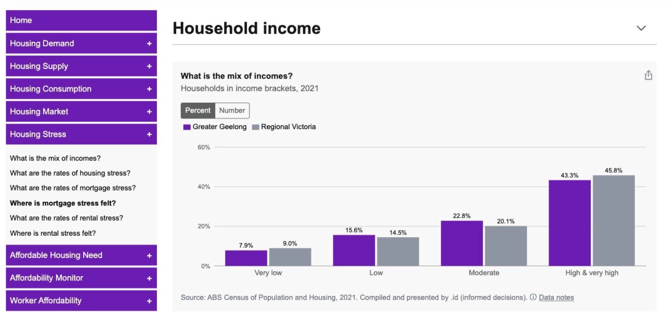
- Click 'What is the mix of incomes?': this opens the Housing Stress page and marks the section in bold in the side menu. Housing Stress is one long scrolling page rather than six separate pages, and the six links are anchors within it.
- Read the mortgage stress map: Scroll down to the ‘Where is mortgage stress felt’ section with the sub-title 'Total households in mortgage stress by SA2'. It shows a shaded map that splits the council area into the small areas the data is reported for (SA2’s) a colour legend along the bottom of the map and a table beneath it with the columns 'Area', 'Number' and 'Percentage'. The table lists the first five areas, then a 'Show all' button which expands all available SA2s.
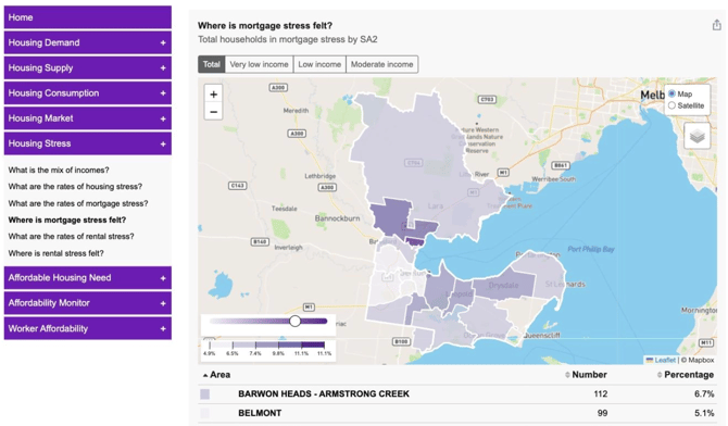
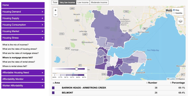
- Filter by income bracket: click one of the four buttons above the map, labelled 'Total', 'Very low income', 'Low income' and 'Moderate income'. 'Total' is selected when the page opens. Selecting a bracket updates the panel sub-title, re-shades the map, changes the legend and recalculates the table together. You can sort the table by Number or Percentage of mortgage paying households in mortgage stress.
- Hover over Map for SA2 detail: Hover mouse over each shaded SA2 for data on the number and percentage of mortgage paying households in mortgage stress.
- Do the same for rental stress: click 'Where is rental stress felt?' in the left navigation, or scroll further down the same page. The panel is headed 'Where is rental stress felt?' and has the same four income bracket buttons, the same map controls and the same 'Area', 'Number' and 'Percentage' table.
What to Expect
You'll have a shaded map of your council area alongside a table of areas, showing the number and percentage of households in mortgage stress or rental stress for the income bracket you selected. Sort the table by clicking the 'Area', 'Number' or 'Percentage' column headings. Each row carries a colour swatch matching its shade on the map, so you can read the table and the map together.
Read the two columns differently. 'Number' is the count of households in that area in that type of stress for the selection you've made. When you select an income bracket, 'Percentage' is that count as a share of households in that bracket, not as a share of all households in the area. That is why the percentages rise sharply and the counts fall when you move from 'Total' to a single bracket.
Troubleshooting
- A chart looks blank. Charts render blank until they're scrolled into view. Scroll past the panel and back to populate it.
- Clicking a menu navigation link doesn't move the page. Scroll down the Housing Stress page to reach it.